
Case studies
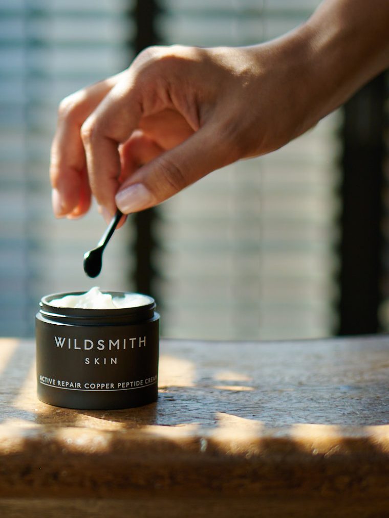
Wildsmith Skin
Case study — A natural language for skincare
Forth Tyne’s work for Wildsmith Skin brings packaging and creative direction together, connecting the products with the way the brand is photographed and presented.
The visual approach moves between precise product detail and the experience of using skincare. Bottles, textures, gestures and quiet settings sit alongside one another, giving the range a consistent character across packaging and imagery.
Packaging design · Creative direction

True Grace
Case study — One story, from fragrance to space
True Grace creates home fragrance from its workshops in Wiltshire. Our partnership began with an identity update and developed over more than seven years to encompass packaging, digital design, retail spaces and product development.
Product names and brand language play a central role in expressing the character of each fragrance. We connected these with the visual identity and physical experience of the brand, creating continuity between the products, their packaging and the spaces in which they are discovered.
Creative direction · Brand identity · Packaging · Product development · Retail design · Digital design · Tone of voice
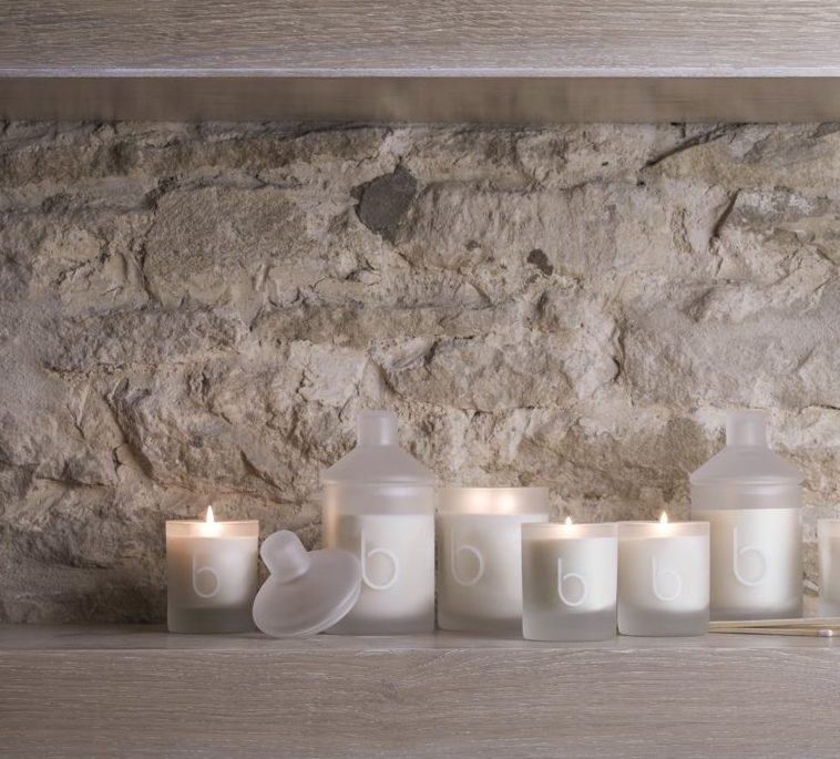
Bamford
Case study — A consistent language across product and image
Our work for Bamford spans packaging, product development, copy and art direction. Across collections, the task is to give each product its own character while keeping it recognisably part of the same brand.
From the B Silent range to essential oils and illustrated gift sets, the work brings together materials, typography and the relationship between container and contents. Fashion and still-life imagery extend that language beyond the packaging, presenting a broader world around the products.
Packaging · Product development · Copywriting · Art direction
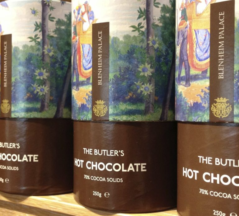
Blenheim Palace
Case study — Bringing the archive to life
Blenheim Palace invited Forth Tyne to create a retail concept inspired by the people who kept the household running. Research in the Marlborough archive revealed stories of the butler, footman, cook and lady’s maid, providing a rich starting point for the collection.
We developed an identity, language, products and packaging that brought these stories into the present. The resulting collection gives visitors another way to connect with the palace: through useful, characterful objects that carry a piece of its history home.
Retail concept · Archive research · Brand identity · Product development · Packaging · Tone of voice
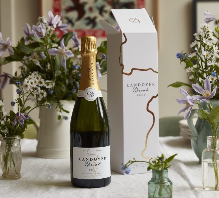
Candover Brook
Case study — A brand rooted in place
Candover Brook is an English sparkling wine producer in Hampshire. Forth Tyne developed its brand across naming, identity, packaging, tone of voice, digital communications and customer experience.
The vineyard’s chalk stream setting and regenerative approach to farming provided the starting point. We translated that sense of place into a coherent identity, connecting the character of the wine with the way the business presents itself. From the bottle and presentation box to imagery and language, each element contributes to the same story.
Creative direction · Naming · Brand identity · Packaging · Tone of voice · Digital communications
Roger Oates
Case study — Textiles in lived spaces
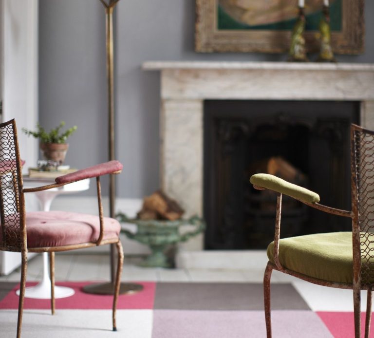
For Roger Oates, Forth Tyne’s art direction presents textiles through the rooms and details that surround them. The work spans imagery for catalogues and online, bringing colour, pattern and material into a shared visual language.
Interior views establish a sense of place, while closer compositions reveal texture and the relationships between different designs. Moving between the room and the detail helps people imagine the textiles in their own spaces, while keeping the character of the collection in focus.
Art direction · Catalogue imagery · Online imagery
Prestel
Case study — From the page to the book fair
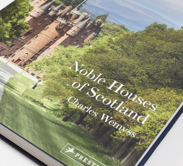
Our work for Prestel connects book design with the spaces in which books are presented. The projects range from covers and interior pages to book-fair exhibition design, bringing editorial and spatial thinking together.
On the page, typography, imagery and sequence shape how a subject is encountered. At the book fair, display and graphic identity give a collection a presence in a shared space. The scale changes, but the emphasis remains on making the books and their content the focus.
Book design · Exhibition design